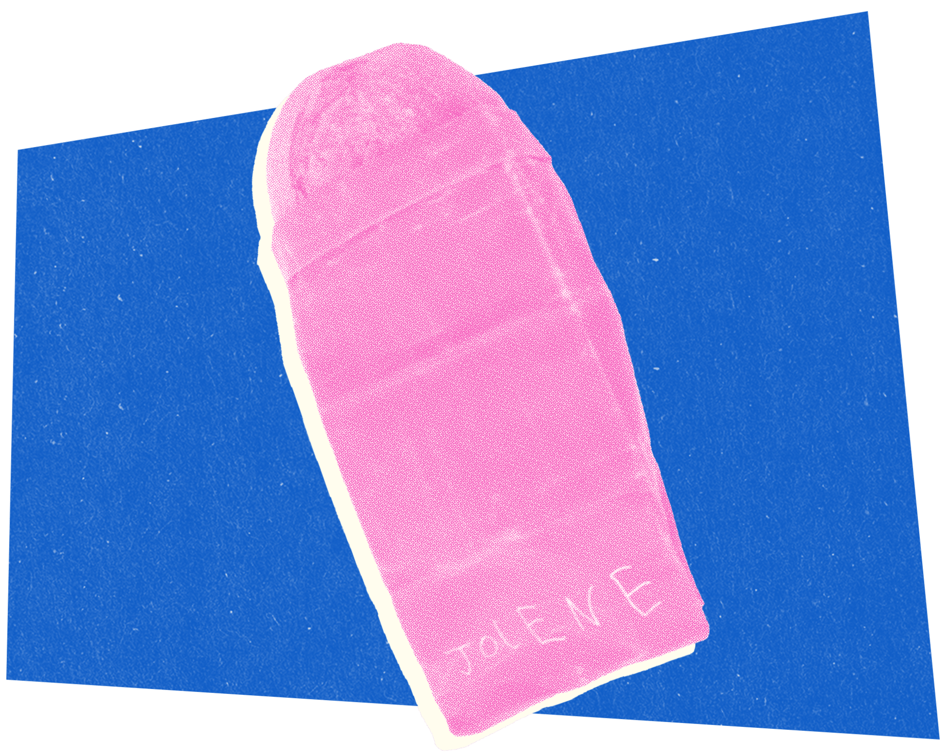
This week, three very different approaches to the same challenge: getting people to believe in what you're selling when everyone's default setting is skepticism. Nike wants you to trust that 22 foam nodes will activate your brain. Ramp wants you to trust that your expense management is painful enough to warrant switching software. Jolene Bakery wants you to trust that a six-year-old's handwriting can represent their brand.

1. Nike's brain massage.
Nike wants to sell you shoes that activate your brain through your feet. The new Mind 001 mule and Mind 002 sneaker feature 22 foam nodes in each sole that move independently like "pistons and gimbals," designed to mimic barefoot walking and stimulate sensory areas of your brain. The science sounds impressive, except Nike hasn't actually released any of the scientific evidence yet, just a promise that a white paper is coming "in a couple weeks."
For years, Nike dominated with foam technology that prioritized comfort, then brands like Vibram FiveFingers and Crocs carved out markets by arguing our feet needed less intervention, not more. Nike's response is characteristically ambitious: instead of choosing a side, they're claiming their bumpy soles offer the best of both worlds: comfort plus sensory stimulation that (supposedly) wakes up your brain. Whether 22 foam nodes actually improve athletic performance or just give you a weird foot massage remains to be seen. But in an era where wellness culture has convinced us we need special water, specific breathing patterns, and now brain-activating shoes, Nike's betting that "neuroscience-based" sounds scientific enough to justify the $95 price tag while they work on producing that evidence.

2. Expense reports as performance art.
In a bizarrely compelling stunt, B2B fintech company Ramp put Brian Baumgartner (aka Kevin from The Office) in a transparent box in Manhattan and made him process expense reports for seven straight hours. Roughly 10,000 people gathered in person to watch the beloved bumbling accountant do mind-numbing paperwork, while 380,000 more tuned into the livestream. The spectacle was part satire, part sales pitch: by putting the pain of manual expense management literally on display, Ramp turned office drudgery into a kind of content spectacle. At one point, Baumgartner even officiated a real wedding inside the box. As one does.
The activation worked because it flipped a common B2B problem into performance art: no one thinks they need better expense software until they see how bad things really are. Watching Kevin suffer through receipt-processing purgatory is funny, but also deeply relatable to anyone who’s spent hours reconciling charges. Ramp’s creative team said their goal was to “make the pain visceral,” especially for audiences who don’t think they have a problem. Mission accomplished. With over 85 million views and more buzz than your average enterprise software rollout, the campaign proves that sometimes the best way to sell boring tools is to make the alternative look hilariously bleak.

3. Six years old, zero revisions.
Most brands spend months agonizing over their logos: strategic decks, moodboards, endless rounds of tweaks. Jolene Bakery in London did the opposite - they handed a piece of paper to a six-year-old and asked them to write “Jolene.” Sloping letters, mixed cases, wobbly spacing, became the bakery’s official logo, now embroidered on curtains, stamped on menus, and printed on tote bags. It works because it doesn’t try to look authentic; it simply is. No curated imperfection. Just a kid’s unfiltered handwriting, preserved exactly as it was drawn.
By treating the handwriting as illustration instead of typography, they gave it room to breathe, letting its informal character shine without becoming kitsch. The approach subtly mirrors Jolene’s ethos of sustainability and future-facing optimism: if the bakery’s mission is to preserve soil for the next generation, then who better to represent that future than a child? It’s also a quiet rejection of the usual visual tropes of artisanal food brands. No letterpress nostalgia or grainy faux-authenticity, just joyful anarchy. As founder Frith Kerr put it, “Childhood has a kind of anarchy to it, before you get bogged down in too much ‘knowledge.’” And sometimes, that’s the clearest vision of all.
Found something curious? Or maybe you want to be a guest curator for one of the next issues? Simply hit ↩️ reply.

