This week, we’re talking type—but with a twist. First, a group of designers turns fonts into ultras-style scarves, so you can rep Futura like it’s your home team. Then, one designer dares to give Comic Sans a second chance (bold move, I know). And finally, Cheetos drops a hilariously bad typeface that embraces messy fingers as a design philosophy.

1. The redemption of Comic Sans.
Few fonts are as infamous as Comic Sans—beloved by kindergarten teachers, loathed by designers. But what if it got a second chance? Queue Shantell Sans, a modern, grown-up take on the world’s most divisive typeface. Created by artist Shantell Martin, it keeps the playful spirit but ditches the clunkiness, balancing personality with polish. It’s wiggly where it counts, serious when needed, and—dare I say—actually cool?
Now available on Google Fonts, they've made the font completely free and open-source, effectively saying "here's our gift to the internet, go wild." And people have: from the Whitney Museum's gift shop to Cash App's debit cards, Shantell Sans is proving that fonts can be both professional and playful. Just don't tell the typography snobs who are still recovering from their Comic Sans trauma.

2. Fonts FC: ultras scarves for type nerds.
What if die-hard typography fans repped their favorite fonts like soccer fans? A design team just dropped a collection of soccer-style scarves that let you pledge allegiance to your favorite font, whether you're Team Helvetica or (gasp) Team Comic Sans. After five years of perfecting their craft, they've transformed everything from Futura's modernist swagger to Papyrus's... well, Papyrus-ness into wearable declarations of typographic devotion.
Each scarf captures the essence of its typeface with limited but deliberate design choices. The project is a love letter to typography, showing that even in a world of pixels and vector curves, fonts can be loud, expressive, and ready to rally a crowd. Just imagine the chants: "Who do we love? Ser-if! When do we want it? Ker-ning!"

3. The cheesiest font ever made.
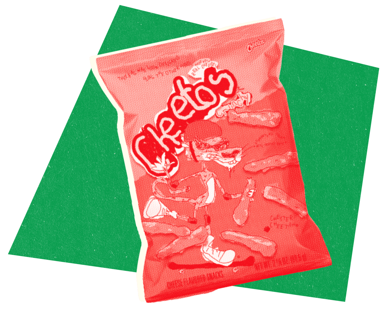
What happens when you design a font while devouring a bag of Cheetos? A hilariously bad typeface, apparently. Cheetos just released The Other Hand Font, a deliberately messy typeface created by designers forced to work with their non-dominant hands while their snack-wielding fingers were covered in that notorious orange dust (or "Cheetle," as Cheetos has officially dubbed it).
Available as both a web download and Chrome plugin, this typographic nightmare can transform any website into what looks like a first-grader's homework assignment. They're even running a contest where fans can submit their own orange-fingered masterpieces to win limited-edition bags featuring a sketchy, skateboarding Chester Cheetah. Just don't try to explain this one to your graphic design professor.
Found something curious? Or maybe you want to be a guest curator for one of the next issues? Simply hit ↩️ reply.

